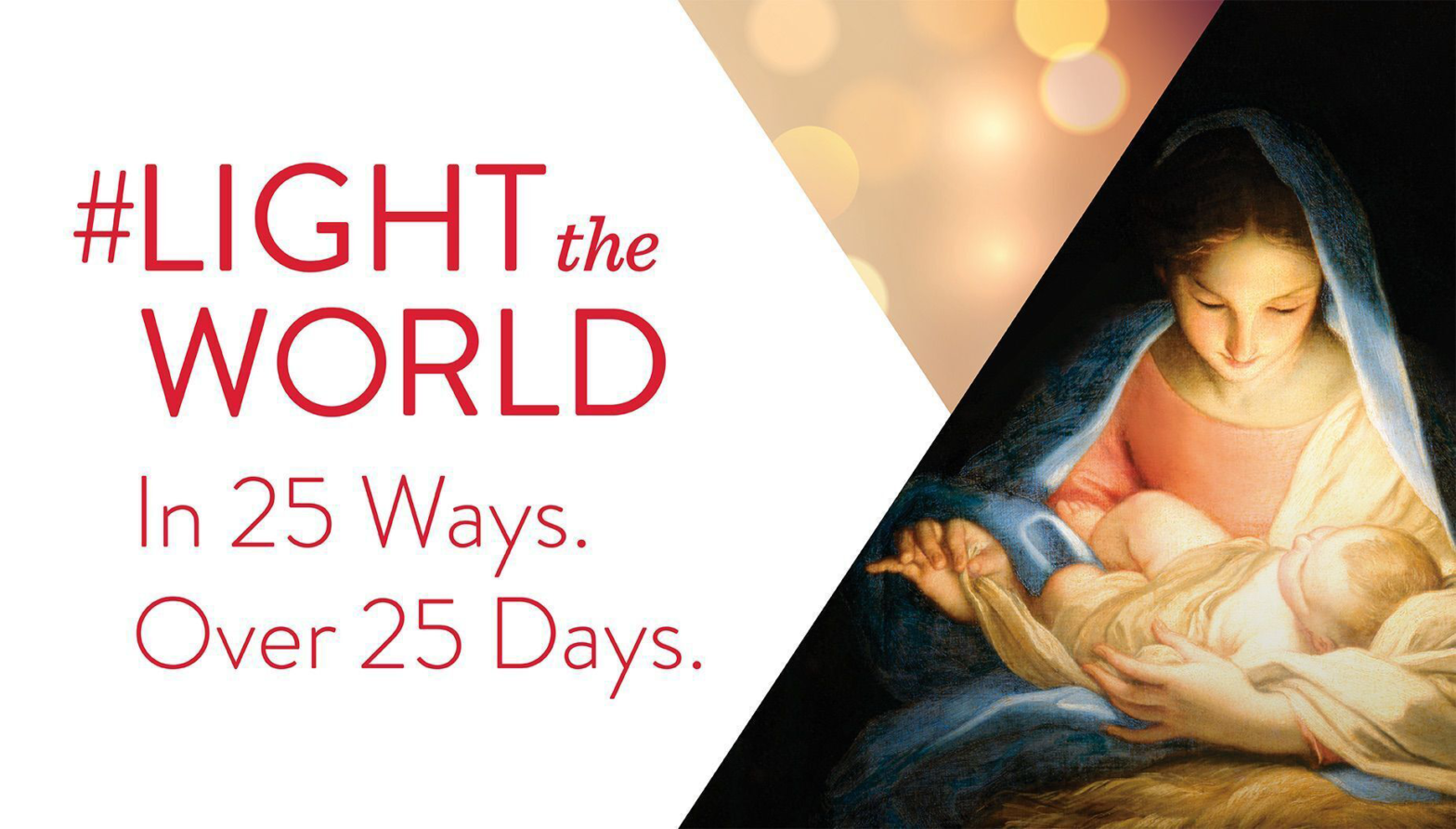
Originally posted on 11 December 2022 by Mary Richards
At theChurchNews.com

Introduction
Originating and made public by the Church on November 25, 2016, the campaign advertisement to #LighttheWorld has become an annual Christmas initiative where participants seek inspiration for service. The article found at theChurchNews.com was the 2022 announcement of the annualized event, posted by Mary Richards, a reporter for the Church News, on 11 December 2022. The annual campaign has created a flurry of participants seeking and performing countless hours of inspired service. Collaterally, hundreds of materials have been generated, downloaded, and printed millions of times, including advent-like calendars, cards, invitations, stickers, magnets, posters, billboards, and more. Notably, “Giving Machines” have been placed in critical social gathering spots where donations can be made to globally alleviate strains of needy families with daily necessities for living. Personal and official videos from the Church have been posted online, increasing the campaign’s visibility.
Contrast
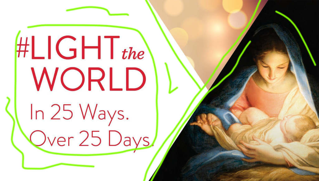
The contrast between the nativity scene and the stark white background of the message, which is in high contrast with the background, is eye-catching. The further contrast of the isosceles triangle above Mary’s head with both flanking zones provides a gradual transition between the right and left extremes yet does not steal away the importance of the messages communicated by the right and left zones. Mary’s cloak in dark blue contrasts with the outside, absent of the light emanating from the Baby Jesus over her face. The thematic font provides the necessary draw as both a social media message and a statement.
Repetition
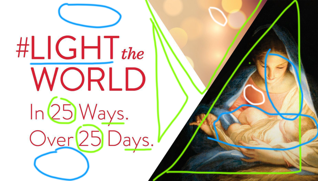
The Light of Christ reflecting from Mary’s face is also tied to the background of the text to the left. There is also an indication of the Light of Christ reflected in the campaign slogan, “Light” in Light the World. A triangle has three sides by definition and could symbolize the Godhead, Father, Son, and Holy Ghost. There are three triangles in the image, a repetition. The color on Mary’s top is near the same elemental color as the triangle above to her right. The circles of that same triangle are repetitive, almost conjuring the notion of blurred Christmas lights. The 25 mentioned in both sentences of the tagline match an advent calendar, inspiring opportunities to be a light in the world, in an outward way. Using the hashtag insinuates a participant’s ability to contribute to spreading the light on social media.
Alignment
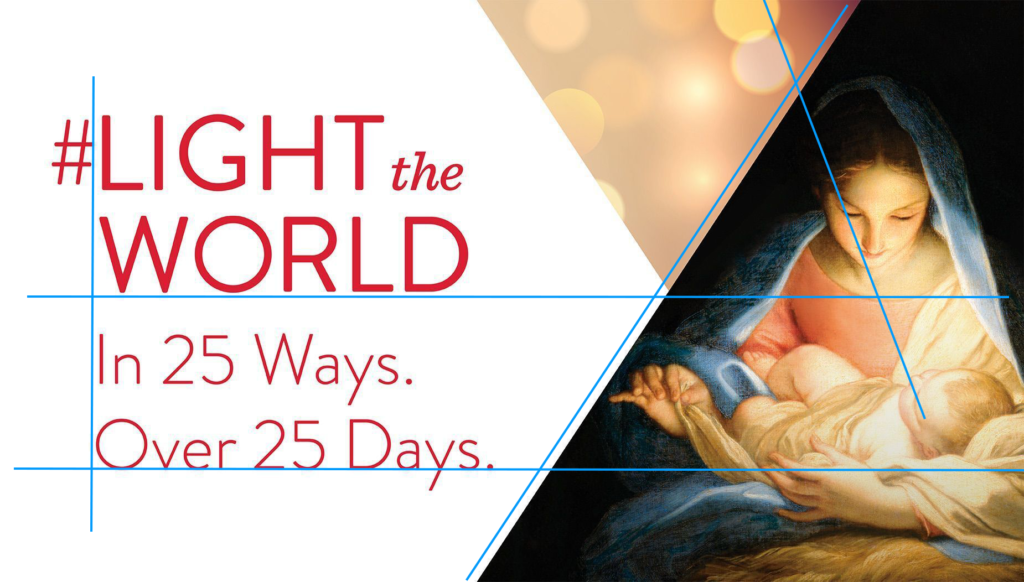
There are some simple and complicated alignments happening in the image. I am sure I missed some of them, but the ones that stuck out the most were the left-justified text with the out-of-bounds, well-placed hashtag. The bottom of the slogan aligned halfway down through the image just under Mary’s neck. The “over 25 days” aligns perfectly with the coddle of the Baby Jesus. The alignment I am nearly certain of is the slope of the chopped dark triangle to the lighter left. The more complicated alignment of the “blurred Christmas lights” lines up through Mary’s right eye to Jesus’ left eye. The orbs could also symbolize the angels peering down from heaven, viewing the birth of the Savior. This is serene and beautiful.
Proximity
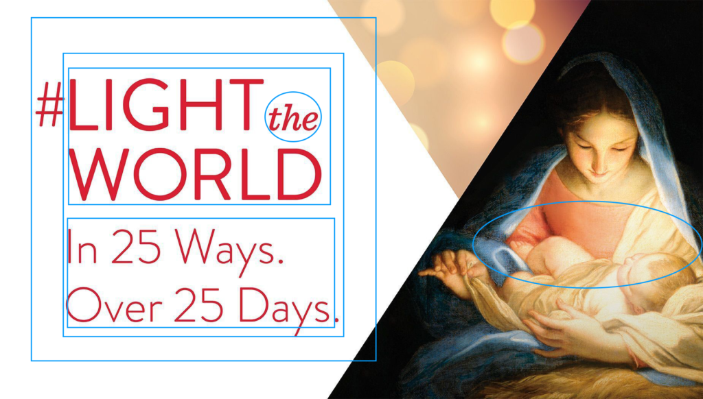
The two text blocks are right against each other. They are distinguishable from one another with different font weights, but the “the” in a completely different font connects the two nouns of the slogan. The quintessential image of Mary and Baby Jesus shows her bringing Him in close for comfort, protection, love, and care.
Color
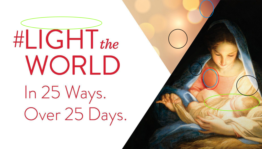
Complimentary colors are used between Mary’s top and the shawl, while analogous colors are used between the two adjacent images. The lighting effect over Baby Jesus is indicated by the word “Light” and around the word in the slogan and the adjacent image to the nativity, lighting spheres of complimentary color. The tints and shades are deep and contrast around the Mother Son duo and further with the white background of the message.
Conclusion
I was excited to resolve into this advertisement example! I toiled through several that were not “professional” enough. But when I landed the Light the World campaign idea, I knew that it would not only be a study in proper design but also help inspire me to do something positive, reflecting on the importance of the message we send to those around us.
The elements were masterfully coordinated, clearly indicating what was important in the message. First and foremost, to “Light the World,” we know our light comes from Jesus Christ, exemplified as a Baby. The familiarity of this image, though ubiquitous in the Christmas season, is only sometimes front of mind.
The color scheme is clean and fresh, almost like peppermint. The intersecting triangles softened the juxtaposed two-color message to the Mary and Jesus Nativity. The fonts and weights were subtle and appropriate, drawing your eyes into the reason and aligning neatly. Like a hanging opportunity, the hashtag insinuates the Social Media insertion participants could use to communicate their contributions. Twenty-five days of service times potentially millions of participants. That reach is impressive. And that it is annual, even more inspiring.
