A reverse engineer post of a bye-gone-era advert and how that company may thrive on that same platform with the “grand daughter.”
Introduction
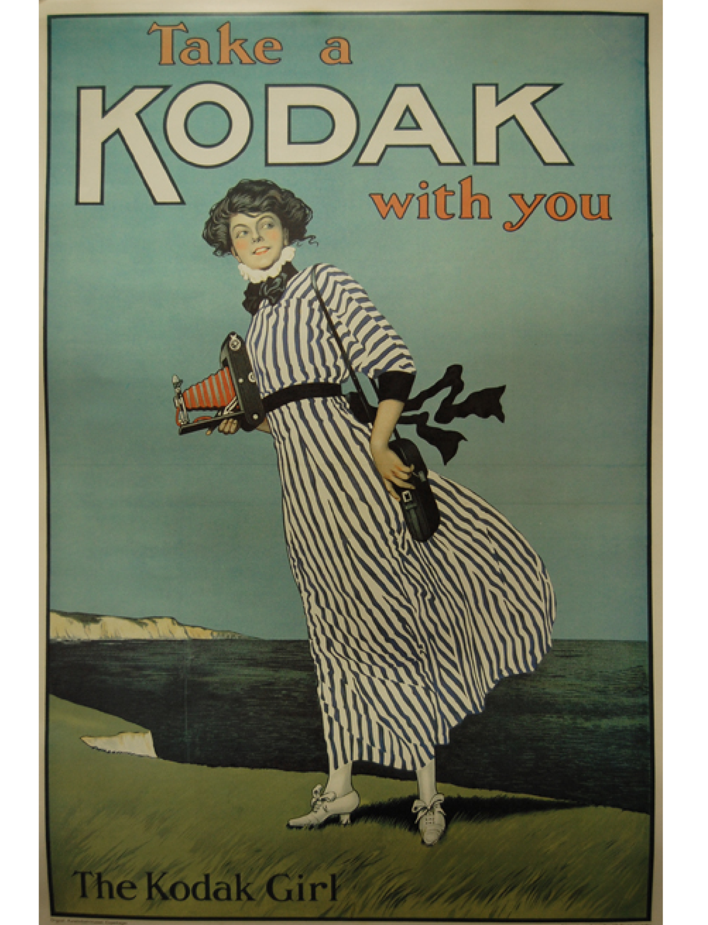
In search of something spectacular, I realized our history is full of amazing people doing extraordinary things with the simple tools they had. Understanding the importance of the archaic tools to market and portray their products, I speculate on how they might accomplish these things, but have hundreds of hours into drawings as drafts, redo’s, ideas, release candidates, etc. Today, we have powerful tools to tweak and edit in seconds with renditions worthy of publication. I pondered this and recognized the energy put into the modern understanding of simple is better. This Kodak ad from yesteryear was the most colorful yet concise ad of the campaign. It was originally published circa 1910, and the author’s name was John Hassall (1868-1948).
Knowing the tools at my disposal are phenomenal powers that John Hassall could only have dreamt of, I put in a couple of hours of work to recreate and bring to pass his idea into a modern take of the ad. The beach might have been in a nearby-place, where I imagined were the White Cliffs of Dover, UK, where one of my favorite instrumental guitar songs is named after, by Eric Johnson. I needed that song accompanying me while I drafted my ad to feel the air, the emotion, and the intensity the subject might have felt in the crisp ocean breeze.
Though the original ad was not published at a time when a “logo” might have been something a company had, an icon for generations to recognize more than just the name, the follow-up recreation was graced with a version of the logo that did not distract from the original image. Though I took this liberty, I hope it is okay.
Another liberty was the difference between the original Autographic camera and the Super 8 in our new ad is a lightyear of difference. The principle of image capture persists, but the speed and effort of the owner in each case are different. Through the original “brownie” camera, we coined the “snapshot” into our vernacular. While the motion picture camera, the Super 8 was the M2 by Kodak in 1965. You can still purchase them today from Kodak as a preferred medium for film students and B-rate movie producers.
Design
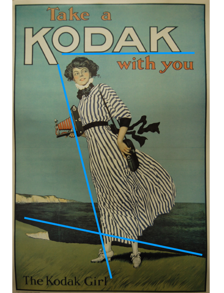
I feel a lot was put into the design of this ad. The forward lean of the “Kodak Girl” invites a motion forward, and in its day, to leverage the latest technology to capture the moments that are important. The use of a female for the ad conjures the notion that the role of documenting her family’s outing is important to her, carrying the camera case and clutching the camera. She looks back as if to beckon her family to come along. This time, it will be something we can look back at with the images we take. The whole scene is framed like a picture might be, to insinuate what your “snapshot” might look like.
Color
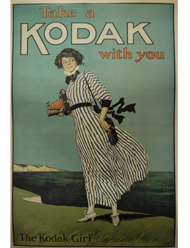
I suspect this ad has been exposed to weather or sunlight and is not in its original glory. Days after I found this version of the ad, I found another with much more precise output. I cannot say if it was original or if it was “restored” in Photoshop by someone else. I continue to use the original I found, though the restored one can be found here. The blues are clean, and the whites are less yellow.
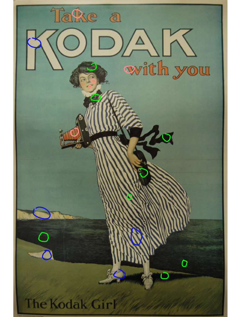
The lightest shade closest to cream can be seen in the font of KODAK, the cliff faces, the dress, and the shoes. This is an easy method of color coordinating, in which a drawing is ironically used to advertise a camera. Same for the darks in the handbag, ribbon sash, colonial tie, dress stripes, camera frame, the dark waters, and hair. The stroke of the font also has this dark tie-in. Finally, a rosy pink color graces, the lips and cheeks of the subject, while appearing in verticals to the KODAK brand and of the expanding body feature of the camera. These colors work in connection to one another to lend variety and control over the ad.
Typography
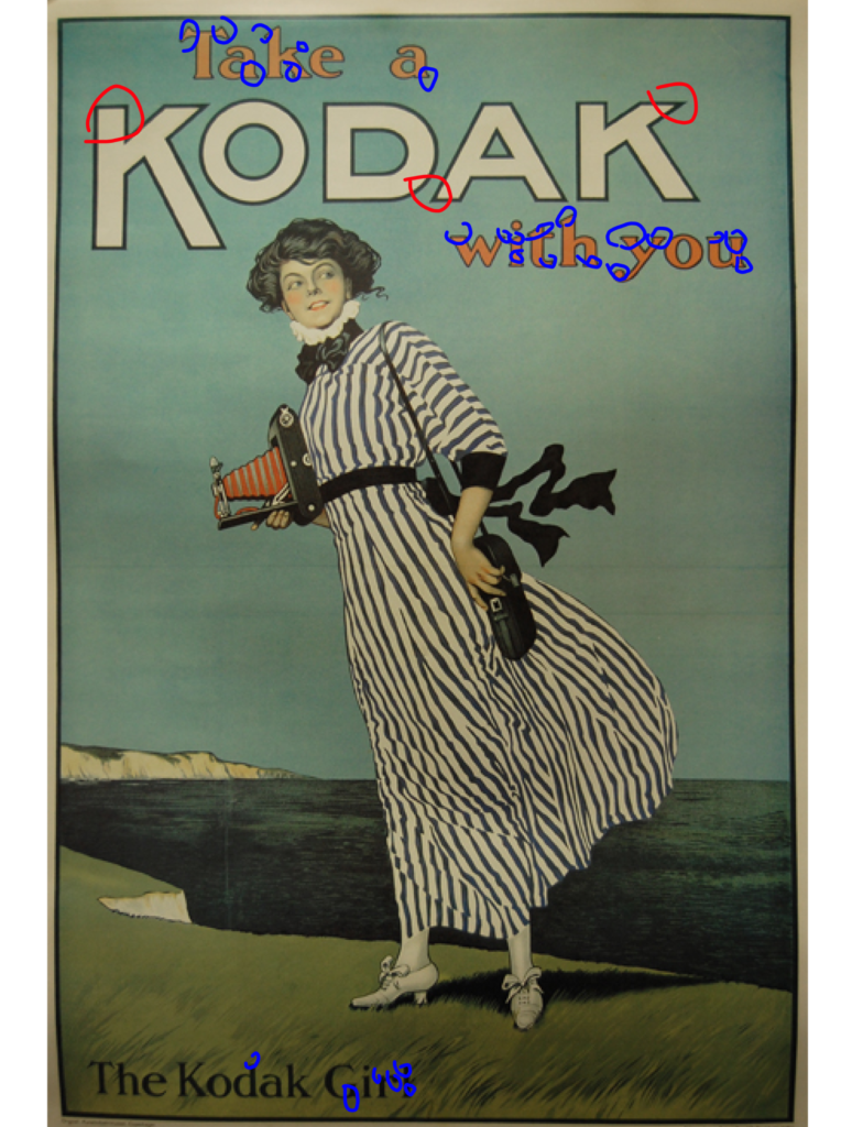
Albeit over a century’s old publication, they still had serif and non serif fonts. These worked together to give more variety to the viewer. The only non serif font is the brand name, KODAK, all in uppercase, and a preceding “K” in even larger font. This is in bold-white with a black stroke for boldness and obviousness. The softness of the embracing sentence, “Take a” and “with you” are in the rosy pink related to the woman’s makeup. I feel like this softens the visual and tames the large font of the brand name. I’ve queued many of the serifs in blue, and the non-serif in red.
Recreation – Design
This version of the ad is the modern “Grand Daughter” of the original (not really; mine is an actual photo, while the drawing might be after a model). The new ad models a newer technology camera of the same brand in a similar location. I did not leverage the same methods of her forward-leaning, but the forward view of the camera, left leg in motion forward, and eye gaze insinuates it. I leveraged the exact colorization I found in the original, including framing, etc. I also added the logo since it was required for the final product.
Color
To tie into the original ad, I used the same font colors. I could not find the exact dress without recreating it, but the one this model is wearing exemplifies how the culture of the 1910s versus the 2020s might have differed. The subject appears to be at the same Cliffs or near it. The color scheme matches somewhat and lands close to home with the original. They are undoubtedly related but forward in time by more than a century. The hat and purse match the font vertically to the brand and what you see in some of the rocks. The grass, jacket, and skirt flash the same greens. The KODAK font color is also in the tan grass.
Typography
The EXACT typography techniques were used in the recreation versus the original. It is not the same font, but as close to a render as I could find after browsing what was available for free. The Serif font is the same as the font above and below the brand at the bottom of the recreation, and the brand itself is a close approximation to the original but with a cleaner and thinner stroke. I am happy with the recreation, but I know it is a throwback in recreation, which makes this one special.
Conclusion
I enjoyed this assignment. I used a lot of creative license, but from an almost “historian” perspective, bringing life to an old ad for a newer product line for the same company. It was almost like doing family history if these two models were related, but that would be a bigger story than the ad! I also liked the study of marketing on yesteryear in a lens for today’s use. I enjoyed theorizing methods of creation versus the actual design tools for today. I enjoyed postulating and examining design theories and putting them into practice, as they are still relevant today.